First, we need to define the range and identify the trend. Here’s a clear definition:
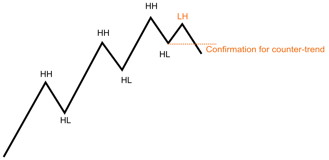
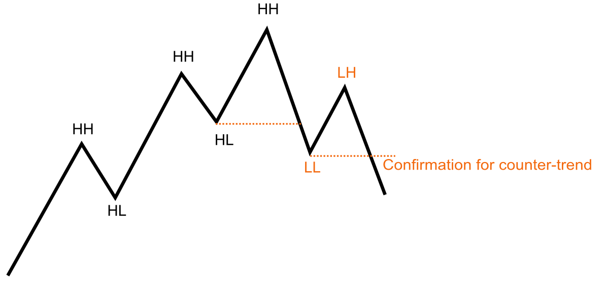
- Uptrend: Characterized by Higher Highs (HH) and Higher Lows (HL).
- Downtrend: Defined by Lower Lows (LL) and Lower Highs (LH).
- Range: Occurs when neither of the above conditions is met.
Now lets dive deeper into all states and transition interfaces between them.
Trends
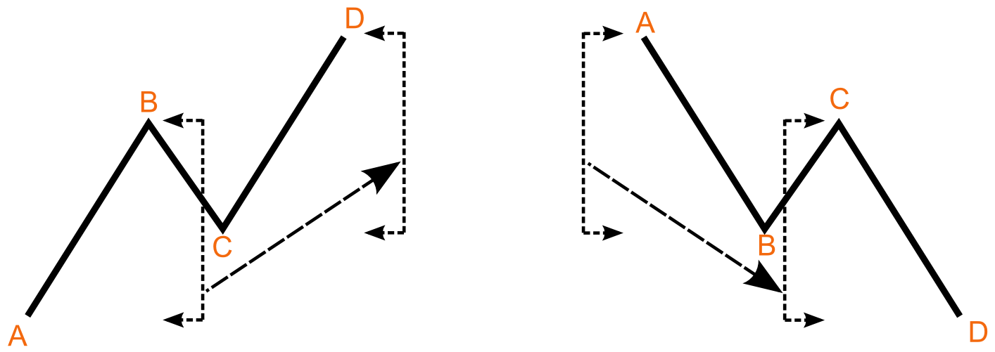
This pattern is a simple yet profoundly powerful concept that defines how markets move. Across all time frames, market movement follows this fundamental structure: an initial movement in one direction, a counter-trend retracement in the opposite direction, and then another leg continuing in the original direction. Traders often refer to this as the ABCD structure, which represents the basic trend pattern. Here, AB is the initial impulse, BC is the pullback, and CD is the second impulse. Typically, CD mirrors the magnitude of AB (a measured move), though there is often a significant margin of error. Comparing AB and CD can provide valuable insights into the conviction of buyers and sellers.
Fundamental Trend Pattern
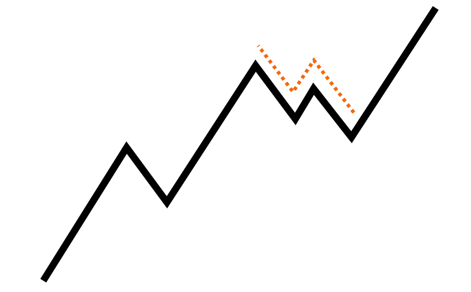
It’s not always this straightforward. Another common pattern is the complex pullback, which involves a standard pullback followed by a failed attempt to resume the original trend. When this attempt fails and reverses, the pullback forms a second leg against the larger trend. A complex pullback actually mirrors a complete trend leg (impulse, pullback, impulse) structure on a lower time frame. It’s rare to find a trend consisting of let’s say five large trend legs interrupted by four simple pullbacks. More commonly, you’ll see five large trend legs interrupted by two simple pullbacks and two complex pullbacks. A complex pullback typically appears as just a simple pullback on a higher time frame. To successfully navigate extended trends, traders must have a solid understanding of complex pullbacks.
Complex Pullback
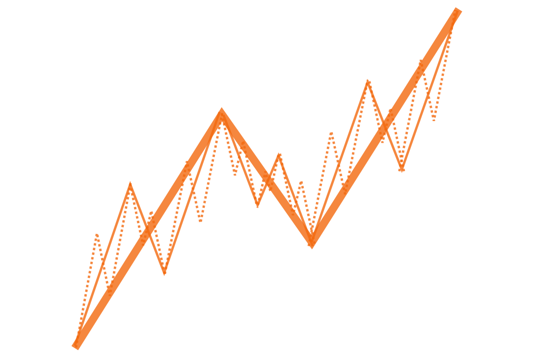
Markets are fractal in nature, meaning the same patterns repeat across all time frames. Every fundamental trend pattern consists of an impulse, a pullback, and a second impulse, and each of these legs further breaks down into the same pattern on lower time frames. No pattern exists in isolation within a single time frame. The market can be compared to a set of Russian nesting dolls—examining one time frame reveals similar structures nested within lower time frames, continuing all the way down to the tick level. Understanding this nested structure is crucial for developing market intuition. While traders typically focus on a specific time frame, it’s essential to recognize that patterns on lower time frames create the structures visible on the trading time frame. At the same time, patterns on the trading time frame are shaped by the evolving dynamics of the next higher time frame.
Fractal Trend Structure
Transition from Trend to Range/Counter-Trend
Let’s assume the market is always in either a trend or a range. Based on this assumption, a trend can break in two ways: it can transition into a range, or it can reverse directly into a counter-trend.
Trend Break #1
Trend Break #2
Ranges
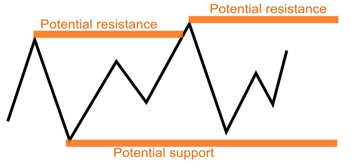
Trading ranges are more complex due to the more random nature of price action within them. The defining characteristic of ranges is the testing of support and resistance near the range boundaries, but the price behavior around these levels is often intricate. Support can be defined as “a price level where sufficient demand emerges to halt, and possibly reverse, a downtrend temporarily,” with resistance being the inverse. However, many support and resistance levels used by traders are likely no more effective than random levels in the market (such as Fibonacci levels). Whenever you refer to a support area, it’s important to include the word potential to emphasize its uncertain nature. Furthermore, support and resistance should be considered zones or areas, rather than precise lines.
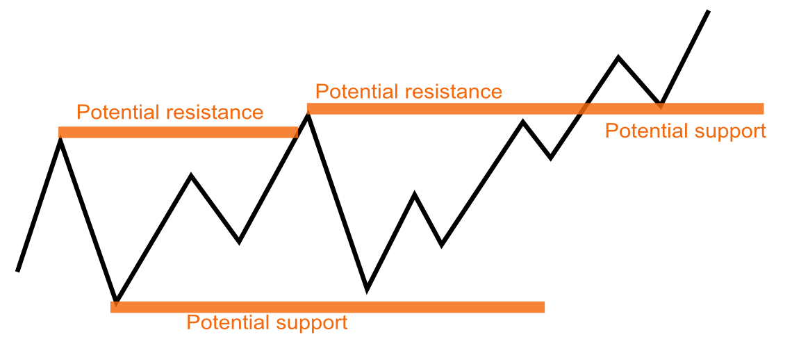
A classic principle of support and resistance is that once support is broken, it can become potential resistance, and once resistance is broken, it can become potential support. This occurs because traders who previously acted at these levels often adjust their positions when price revisits them. For example, at a resistance level, traders may have tried to sell enough to keep prices from rising. If the price breaks through that resistance, those traders incur losses on their short positions entered at that level. When the price returns to the same level after moving higher, these traders may cover their shorts (buy back) to break even and limit further losses. This buying activity can turn the former resistance into a new support level.
Broken Resistance Becomes Support
Transition from Range to Trend
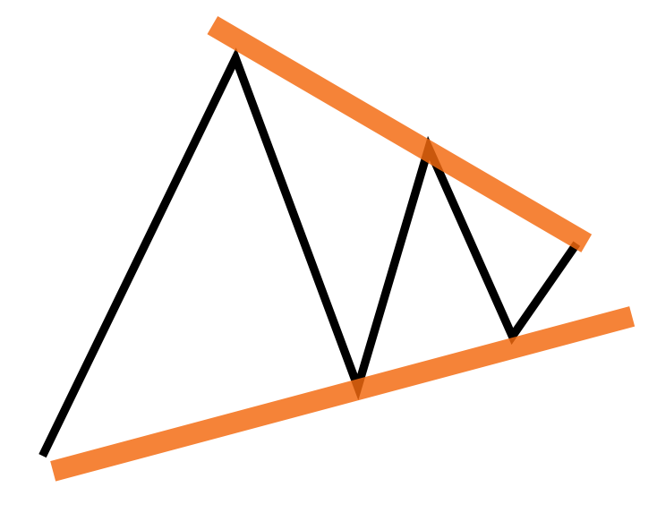
Converging Range. A common variation of the trading range involves the market making progressively smaller swings, seemingly converging toward a target price level. On price charts, this pattern often resembles a triangle, with the edges of the range narrowing to a point in the future.The trading rule for triangles is straightforward: avoid fading the first breakout from such formations. While these breakouts may not always be consistent or reliable enough to form the basis of a trading strategy, it’s crucial to avoid being on the wrong side of a strong move emerging from any type of consolidation.
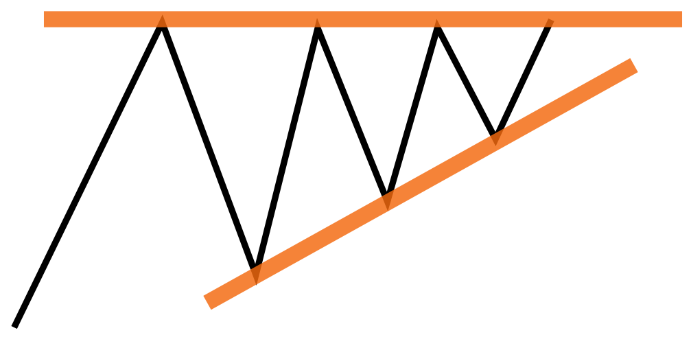
Higher Lows into Resistance. A classic pattern emerges when prices consistently form higher lows while pressing against a relatively well-defined resistance level. This is known as an ascending triangle pattern. To grasp its significance, imagine a market oscillating randomly within a trading range. Now, suppose large buyers become interested in accumulating positions. Their logical strategy would be to buy at the lowest prices available, leading them to step in during market declines, gradually driving the lows higher as they build their positions.
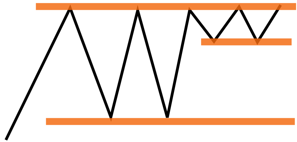
Tight Range Near Extreme of Larger Range. Another pattern, closely related to the previous one, occurs when the market forms a tight range near the edge of a larger, established trading range. This tight range is typically less than 25% of the height of the larger range and indicates that large traders have become actively engaged, keeping the price pinned near the boundary of the broader range. Why are these traders now willing to buy at higher prices (or short at lower prices) instead of allowing the market to drift naturally back toward the center of the range? This behavior suggests increased urgency and stronger conviction in their actions. Such patterns often precede significant breakout trades, as the market aligns with their intentions.
There are numerous variations of these converging ranges, commonly referred to by chartists as symmetrical triangles, ascending or descending triangles, wedges, pennants, and similar formations. While these are often traditionally viewed as continuation patterns, I see them all as essentially the same. They represent volatility compression, signaling a period of consolidation. This alerts us to be prepared for a breakout, focusing on the likelihood of continuation once the price moves decisively out of these ranges.
Expanding Ranges. Chartists also identify patterns such as widening triangles, where each successive swing, both up and down, is larger than the previous one. Similarly, diamond-shaped formations start with price expansion before contracting into a classic triangle. Each of these patterns comes with its own set of trading rules and targets. My approach to these formations is straightforward: they indicate market confusion, as reflected by the erratic price action. In such cases, I prefer not to hold a position. Expanding volatility in a nondirectional manner makes it challenging to define risk or manage positions effectively. Moreover, these patterns often deplete a significant amount of the market’s energy, and strong moves rarely follow. Instead, they tend to resolve into random, directionless, low-volatility ranges.
gl hf
