Standard Trendline
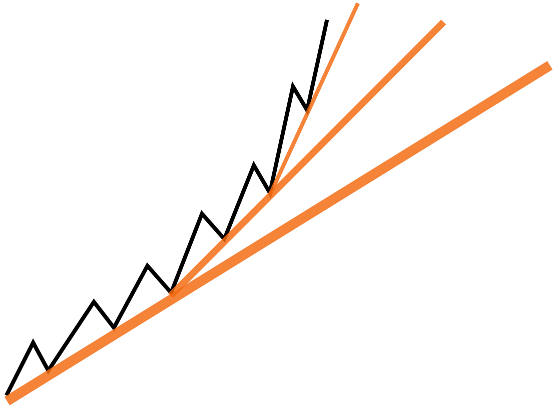
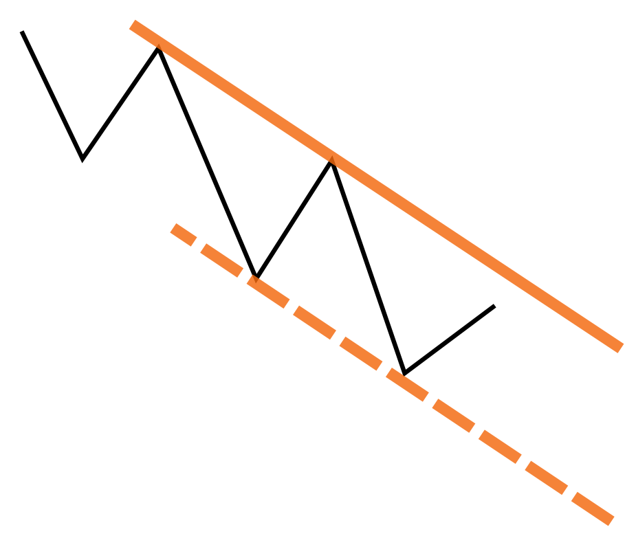
Standard trendlines are foundational tools for analyzing market trends. In an uptrend, trendlines are drawn connecting higher lows, marking points where buyers step in with additional demand to push the market higher. Wyckoff referred to this line as the demand line. In contrast, a downtrend trendline connects lower highs, indicating where sellers have entered to cap market rallies. This is known as the supply line. When drawing standard trendlines, keep the following principles in mind: Follow the Trend’s Slope – uptrend lines slope upward, while downtrend lines slope downward; Positioning – uptrend lines are drawn below prices as potential support zones, while downtrend lines are above prices, indicating potential resistance areas.
Rules for Determining the Significance of Trendlines
- Higher Time Frames Hold More Weight: Trendlines on higher time frames carry more significance than those on lower time frames.
- Number of Touches Increases Importance: A trendline gains credibility as a dynamic support or resistance zone the more it is touched or approached.
- Steepness Reduces Reliability: Steeper trendlines are generally less significant and more prone to failure.
The Parallel Trendline
Parallel trendlines are powerful tools for creating trend channels, which help define the market’s accepted range of fluctuations. Constructing a parallel trendline involves three steps:
- Draw a Standard Trendline: Begin by identifying and drawing a correct standard trendline.
- Create a Parallel Line: Clone the trendline using your charting software or manually draw a parallel line while preserving the original angle.
- Anchor to the Opposite Side of the Trend: Attach the parallel line to the most extreme point on the opposite side of the trend between the two anchor points of the standard trendline. For an uptrend, this would be pivot highs, and for a downtrend, pivot lows. Ensure the parallel line does not intersect prices between these anchor points.
Purpose:
Parallel trendlines form a channel, providing a visual representation of the range of fluctuations the market considers normal.
- In an uptrend, when prices reach the upper parallel line, consider taking defensive actions, such as partial profit-taking, as it often represents a zone of potential reversal or increased volatility.
- In a downtrend, the lower parallel line serves a similar function, inverted.
While the market can break out of these channels and continue trending, these areas frequently act as zones of heightened activity and reversal potential.
Logarithmic and Arithmetic Scaling
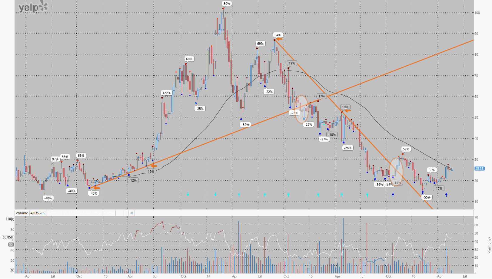
Look at the weekly chart of YELP.

The chart features uptrend and downtrend lines drawn through the second-order pivot points (highlighted with orange arrows). On the logarithmic chart, the uptrend line was violated in April 2014, while the downtrend line broke in May 2016. However, when observing the same trendlines on the arithmetic chart, the uptrend line was violated later, in November 2014, and the downtrend line broke earlier, in November 2015.

Remember that on a logarithmic scale, identical uptrend lines tend to break earlier, while identical downtrend lines tend to break later compared to an arithmetic scale. This is due to the logarithmic scale’s emphasis on percentage changes, which adjusts the perception of price movements by compressing higher prices and expanding lower ones, altering how trendlines interact with price action.
gl hf

