The first thing to understand about market movements is that markets move in cycles—on all time frames. Most people don’t realize that bubbles are neither good nor bad; they simply exist because we are human. We borrow, lend, fear and hope—that’s why markets behave as they do. There is an excellent video by Bridgewater that explains how the economic machine works. This video has been translated into many languages, so take a look:
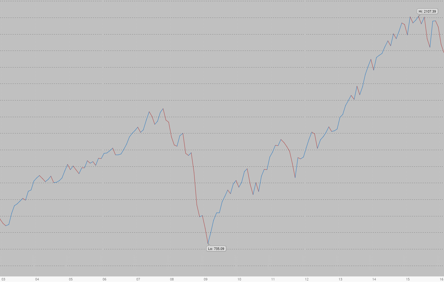
You should have noticed the sine-wave line moving up in the video above—that was an idealized representation of a market. Now, take a look at the real S&P 500 index (aka SPX) performance during 2003–2016:
It looks quite similar to the sine-wave cycle from the video, but you may notice that the real picture is noisier. This SPX line was built by connecting 156 dots, with each dot representing the value of SPX at the end of the month, giving it a resolution of 12 points per year. But what if we want to see more information about each month—not only where SPX closed, but also the high of the month, the low of the month, and where the month opened? We can achieve this by replacing each dot with a candle.
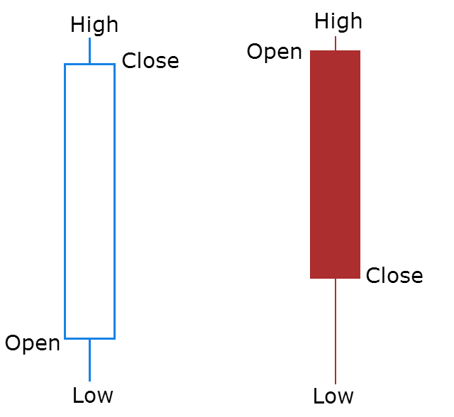
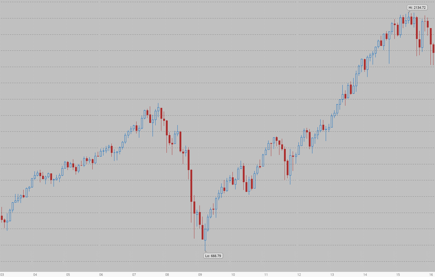
Candles are a better way to represent information on a chart. Candles are usually empty and blue/green if the closing value is above the opening value. They are usually filled and red if the closing value is below the opening value. The candle wicks show the range of prices during the period. Now, take a look at the SPX performance:
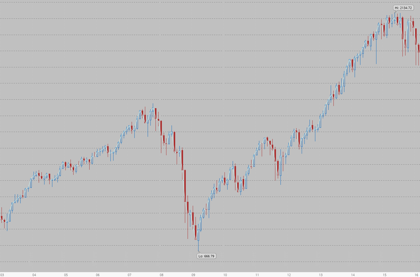
This chart looks very similar, but now we not only gain more information about each month, we also get a clearer picture of where the market has been. Compare the lowest and highest values of SPX on both charts—they are different. You can’t see the actual highs and lows on a line chart because it doesn’t show the range where prices moved during the time period. Sometimes the difference can be significant; for instance, the SPX’s lowest values differ by 10%.
However, the chart is not the market—it is a representation of the market, a useful way to summarize and organize data, though it inherently involves some loss of detail. As you may remember, supply and demand imbalances are what really move the market. The chart is just a tool we use to gather information about supply and demand. And since a chart is a tool:
- The more you craft with a tool the easier it gets
- Keep your tools clean and well-organized
- Never add indicators whose principles you don’t understand
- Avoid changing charts frequently
gl hf


